Designs for ICE.gov
CURRENT POLITICS ASIDE, in 2014 there was a design challenge that needed solving.
The ICE Website had an enormous amount of content, we worked hard to create a site structure and navigation to make everything more accessible, supported by visual design, of course!
Contact
Get in touch with me
Client Quote
"This is a complex project, crossing agency data centers, transferring from one content management system to another, while providing a visually interesting and informative agency website. Great job."
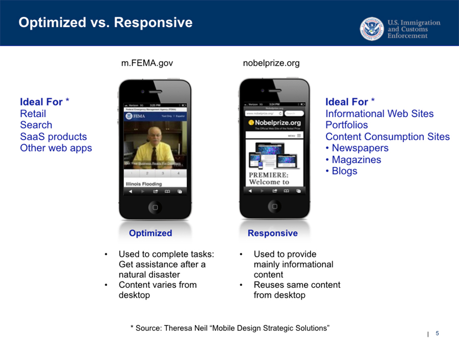
Planning for Mobile

We looked at various government sites that had a mobile presence. I gathered findings together and made a case for going responsive— it was best for ICE and within reach even following the requirement to develop using Drupal.
Day One
This is how the site appeared when it was first released. The development team did an amazing job translating my designs into reality.
Visual Design
A snapshot of the mobile design on day one.
Visual Styles

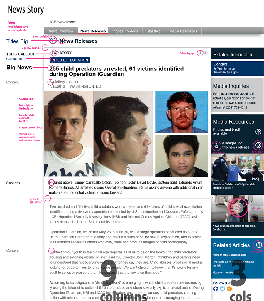
I created a visual system to organize the large amounts of information users would need to interact with. I used color selectively to guide their eyes to key points and features. I also designed in a modular fashion, so components would be re-used, simplifying the experience for end users as well as for development.
Staying True

Our team was great to work with, even though I moved on to other projects, I continued to support the effort with feedback and recommendations to help improve things, shown with bright pink comments.