Copa Airlines Project Concepts
My role for this project focused on visual design, with a sub-role of cat herder trying to keep us moving forward with team members coming and going.
Contact
Get in touch with meAirline Agent User Testing Quote
"I see the ticket number, seat, bags, frequent flyer number, special services information. This is easy for me to look at."
Seat Maps
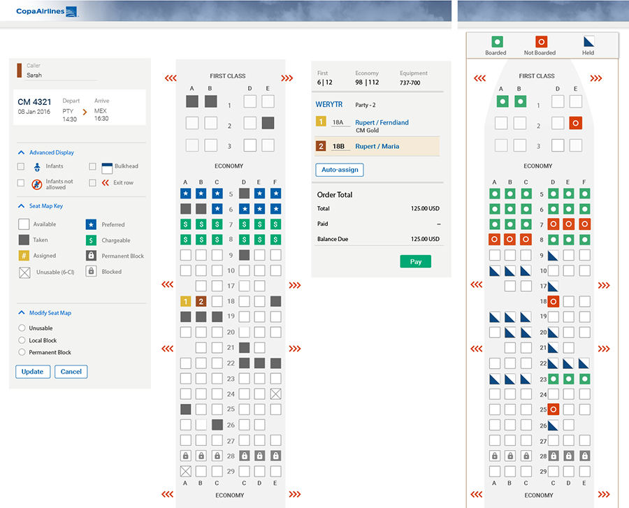
These are concepts for seat maps, optimized for different uses by agents. Left: prior to flight, right: during boarding process.
Visual Design
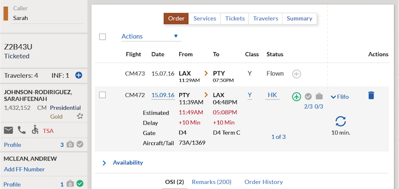
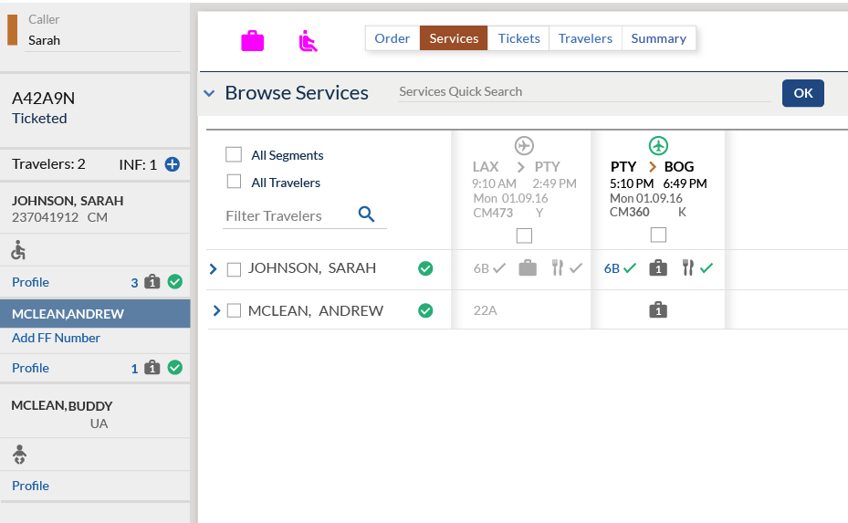
My primary role was visual design. These are snapshots or parts of the screens I helped to create. Full designs cannot be shown because they are proprietary and sensitive to Copa's operations. The top shows concept development for a passenger's travel reservation while the bottom image focuses on added services such as meals and baggage.
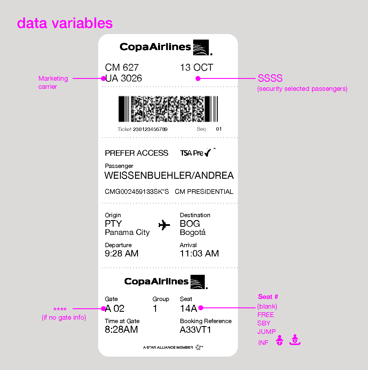
Boarding Passes
I was asked to explore ideas for boarding passes, but due to more pressing project issues, I could not continue. Later, I came back and spent a few hours on further explorations, to challenge myself to show how these designs could be improved.
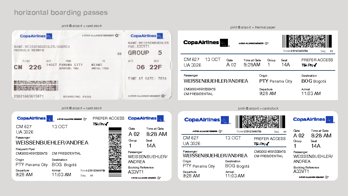
An actual boarding pass (top left) and 3 different new layout ideas, variations on stock for printing at the airport were also considered.
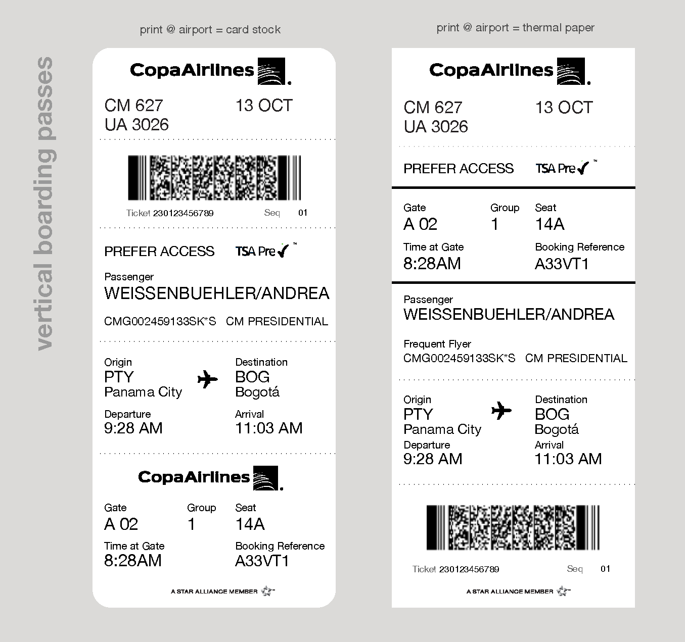
A new approach to boarding passes—a vertical presentation. This option shows two layouts and also reflects the two formats for printing at the airport.
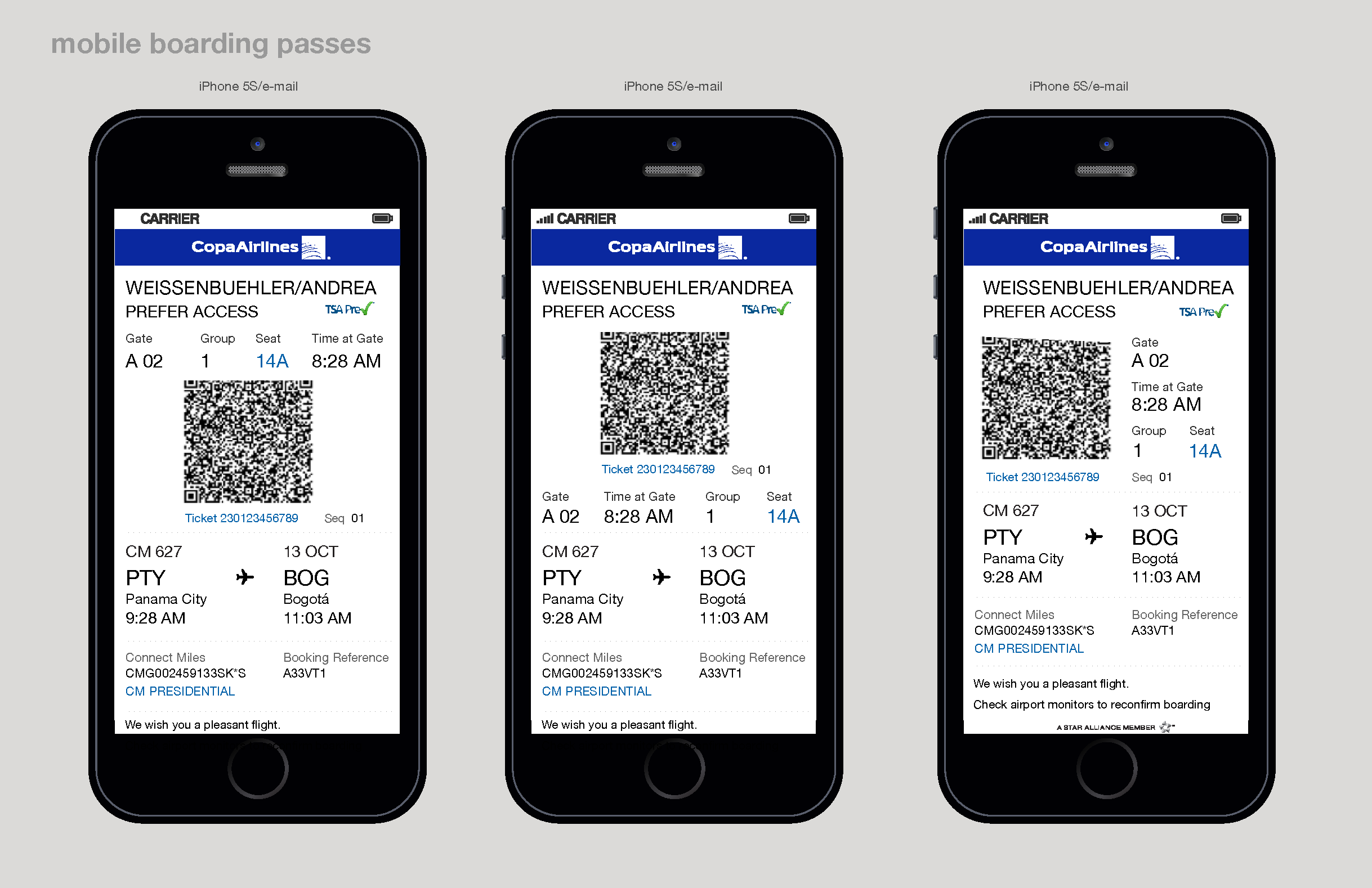
Different layouts to present boarding pass information.
I prepared notes for the project team; in case they could use these ideas in the future. Even after rolling off the project, I provided some minimal support to my teammates with feedback and user experience coaching.