Typography
Coursework at Texas State led me on new typographic paths. I've never considered myself a type expert, but these experiences were a celebration of letterforms!
Contact
Get in touch with me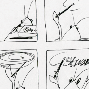
Animated Type
The Project
Create an animated title sequence featuring five type designers or experts to promote typography conference TypeCon 2011, held in New Orleans, Louisiana.
The Process
I explored the culture of New Orleans to set the theme. Next, I selected type specimens to feature. I storyboarded the different scenes to help plan the details.
I used Adobe Illustrator and a Wacom Cintiq tablet to create each frame. I created type samples online, tracing them to preserve their styles while also matching my hand drawn scenes.
The Result
A hand drawn animation of a friendly crawfish character (an icon of the host city and state) interacting with type specimens to showcase the work of featured speakers.
This project won the Juror’s Award at our MFA show, one of the judges said it was the only project that had levity!
See storyboard sketches to see how ideas developed.
Animation: Surge of Crawfish and Type from MFA Typography on Vimeo.
Type in Motion
The Project
Prague-based type designer Jan Tomas visited Texas State for a workshop. Jan and a group of students from the MFA program worked together to create a typographic project. Each participant was tasked with designing a letter to help spell out Communication Design. I was assigned the letter g.
The Process
I explored various examples of lowercase g letters and settled upon a geometric approach, finding it satisfying to create a bold ear and a descender with a spacious bowl.
The Result
The entire group designed letterforms in black and white, we put them all together as our collaborative outcome. Participants in the workshop enjoyed the work so much that we continued with additional meetings to add color, motion and sound.
This project inspired me to take my creation further and start designing a typeface—something I had never done.
Exhibition Type
The Project
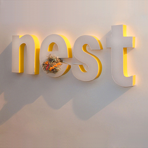
To create dimensional type in a physical form to be used for the title of a museum exhibition.
The Process
The spark that inspired this project was an exhibit at the Harvard Museum of Natural History about birds and their eggs. I added to the exhibit storyline for the purposes of my project: exploring the ways feathered engineers (birds) build safe nests for laying eggs and raising hatchlings.
The exhibit type worked to illustrate the ingenuity of birds by showing how they might choose a nesting site in unusual locations, such as in spaces inside the letters of signs. This was further demonstrated by including materials used by birds—both natural and those left by humans.
The Result
Dimensional letter forms were designed to be attached to the exhibit space wall. Letters were cut out of styrofoam, forming the word nest. Letter faces were covered with pearlescent white paper, the sides in shiny bright yellow, creating a visual showcase for nesting materials.